Hey guys! So for Project 4, you are being asked to design a trifold brochure containing information about the charity/ awareness you have been working on so far this semester. So far we have created your CTA/Logo, Posters, a Web Layout, and finally now a Brochure.
Many organizations use brochures. Brochures are a fast and inexpensive way (in some cases) to help market their company. There are also multiple types of brochures as well as a multitude of sizes that these brochures can be. In the case for this class, I am asking you to design a simple trifold brochure that is standard letter size. These brochures also need to have a common thread to them that links them to the past designs you have done. If you haven't noticed by now, each of these projects branches off the others and in the end come together as a whole in order to market your organization.
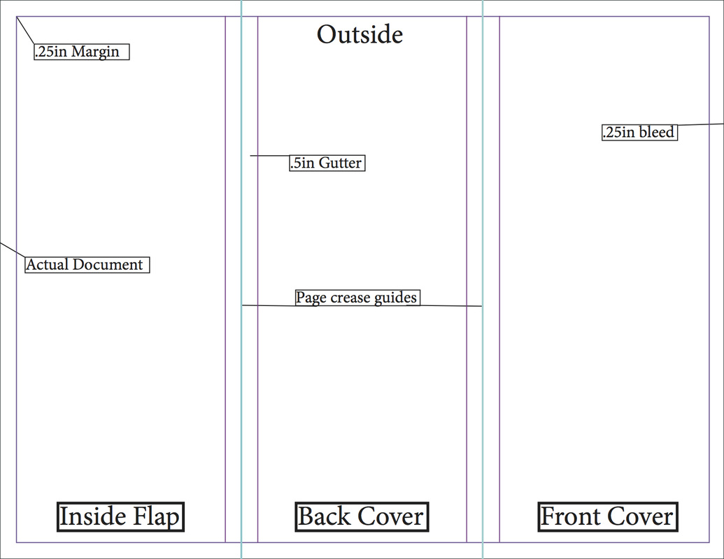
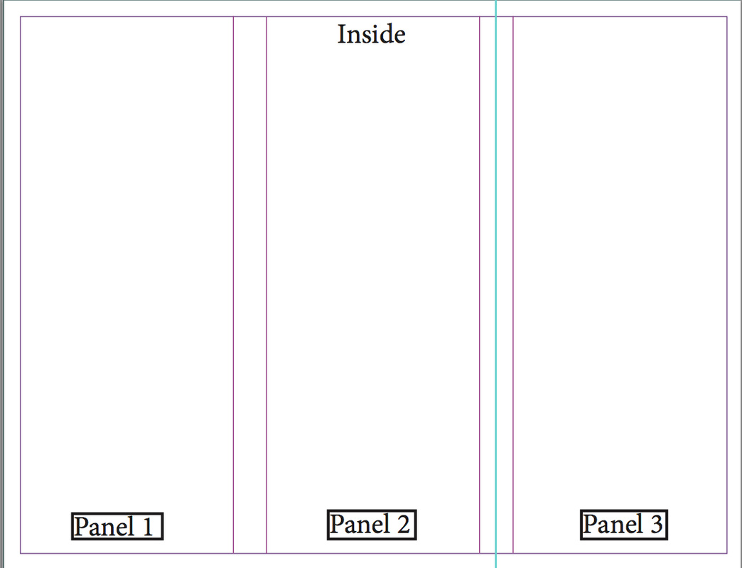
The Brochure:
Size: Letter
Pages: 2 (turn facing pages off so that they can be printed double-sided)
Orientation: Landscape
Columns: 3
Gutter: .5"
Margins: .25"
Bleed: .25"
We also went over how to find exactly where your folds will be. The page folds will be in the center of your gutters (spacing between your columns). One is located at 3.66" and the other at 7.33".
Things to remember:
Be sure to pay attention to your margins so you know where to align your text.
If you are making whole color fields as backgrounds, you need to make sure you pull the color all the way to your bleed. This ensures that if your page shifts when printing, your page won't be affected.
You can have images that extend onto multiple panels, however pay attention to your page folds so that your images don't look weird if they are on a fold.
Be creative with these brochures. Don't just turn in some boring brochure like you see online. Use your imagination and design skills to make something unique to your and your cause.
Graded:
You will be graded on your craftsmanship of these brochures. Watch your edges, spacing, and alignment. In the past, you have all had minor problems with these. You will be graded off for these mistakes on this project. You know enough about InDesign to create really nice layouts. Take advantage of InDesign's smart guides to help you layout your images and text. Use your knowledge of typography to make sure your kerning is correct. Brochures are relatively easy to make, however, they can be challenging when you are trying to space text and imagery properly. You will also be graded on how well these brochures fit into the rest of the work you have done. They need to have that same feel as the rest of your marketing material you created this semester.
Finally, if you have a problem, no matter how minor or dumb you may think it is, please get with me now and not last second! I will help you any way I can.
Many organizations use brochures. Brochures are a fast and inexpensive way (in some cases) to help market their company. There are also multiple types of brochures as well as a multitude of sizes that these brochures can be. In the case for this class, I am asking you to design a simple trifold brochure that is standard letter size. These brochures also need to have a common thread to them that links them to the past designs you have done. If you haven't noticed by now, each of these projects branches off the others and in the end come together as a whole in order to market your organization.
The Brochure:
Size: Letter
Pages: 2 (turn facing pages off so that they can be printed double-sided)
Orientation: Landscape
Columns: 3
Gutter: .5"
Margins: .25"
Bleed: .25"
We also went over how to find exactly where your folds will be. The page folds will be in the center of your gutters (spacing between your columns). One is located at 3.66" and the other at 7.33".
Things to remember:
Be sure to pay attention to your margins so you know where to align your text.
If you are making whole color fields as backgrounds, you need to make sure you pull the color all the way to your bleed. This ensures that if your page shifts when printing, your page won't be affected.
You can have images that extend onto multiple panels, however pay attention to your page folds so that your images don't look weird if they are on a fold.
Be creative with these brochures. Don't just turn in some boring brochure like you see online. Use your imagination and design skills to make something unique to your and your cause.
Graded:
You will be graded on your craftsmanship of these brochures. Watch your edges, spacing, and alignment. In the past, you have all had minor problems with these. You will be graded off for these mistakes on this project. You know enough about InDesign to create really nice layouts. Take advantage of InDesign's smart guides to help you layout your images and text. Use your knowledge of typography to make sure your kerning is correct. Brochures are relatively easy to make, however, they can be challenging when you are trying to space text and imagery properly. You will also be graded on how well these brochures fit into the rest of the work you have done. They need to have that same feel as the rest of your marketing material you created this semester.
Finally, if you have a problem, no matter how minor or dumb you may think it is, please get with me now and not last second! I will help you any way I can.
 RSS Feed